Title 2
This was done using Gimp 1.2 (with standard extras and perl-fu).
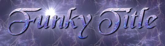
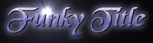
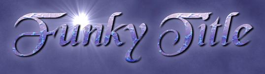
This title image is the result:
I did this one this way because, while I love the Starscape
script-fu, it doesn't allow you to change the texturing of the
lettering, which means that everybody who's ever used Gimp knows
exactly what you did and it feels less creative.
This time I'm going to actually re-do this process with snapshots along the way, but this is an exception to the rule.
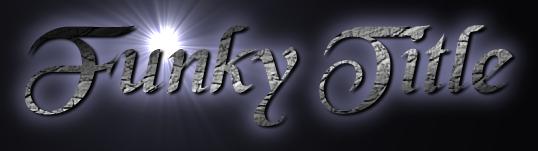
- Call the starscape Logo script-fu (with "black" font at size
100 and a glow colour which was 240 degrees and low saturation to
go with the colour scheme).
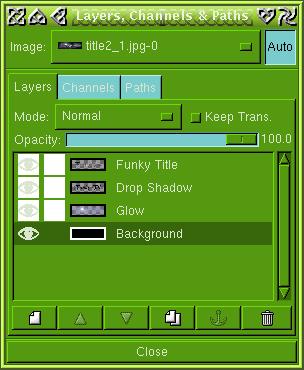
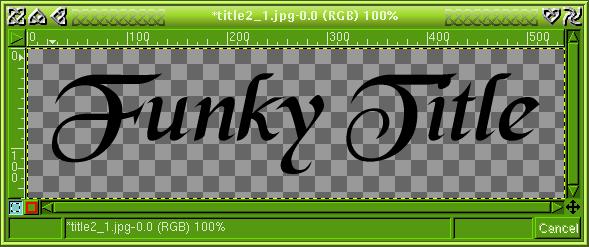
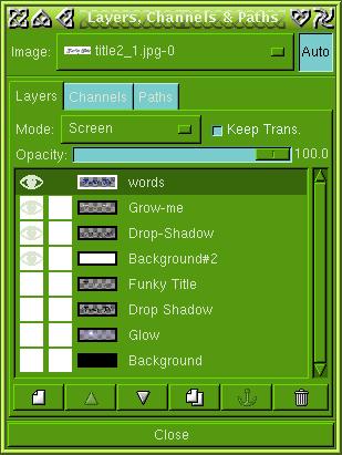
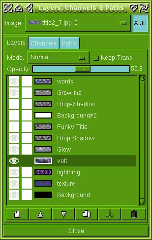
- take the words layer, copied it, calling it "words"
- hide everything but that
- turn it black with Image -> Colors -> Threshold
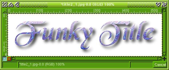
- apply the alpha-to-logo "glossy" script-fu with the default
pattern "for text instead of gradient"
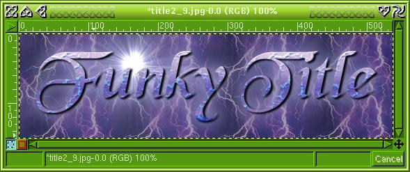
- hide the second background and the second shadow, and re-show
the other layers, and look at it. You can toss up between which
drop-shadow you use -- one of them is deeper than the other.
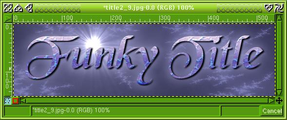
- the background, which is three new layers
- bottom, filled with the gblue_cloud3 pattern, then darkened
with brightness-contrast;
- another layer filled with the lightening pattern, made
semi-transparent with the Opacity slide in the Layers Channels
& Paths window;
- another layer made with the Filters -> Render -> Patterns
-> Fractal Explorer "high voltage" preset, (tweaked the colour
to make red and green level and blue more) also made
semi-transparent.
- bottom, filled with the gblue_cloud3 pattern, then darkened
with brightness-contrast;
- Layers -> Flatten-Image and saved as a .jpg file.