Fun With Differences
This was done using Gimp 2.2
This is an example of how one can get very pretty effects with just two things: gradients, and differences.
This background is one of the results:

- Select gradient fill. I chose the pre-existing "Deep Sea" gradient.
- Set guides Image -> Guides -> New Guide (by percent) which give you cross-hairs in the centre of the image.
- Make a bi-linear gradient from the centre to the corner.
- Make a new layer. Make a ring-like gradient by selecting "Radial" and "Triangular Wave" in the gradients options, and go from the centre to near the edge (but not quite there).
- Build up a few layers in this fashion.
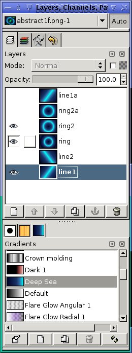
- Duplicate some of the layers, make reflected copies, do what you like.
- Set the mode of all layers to "Difference". Make layers visible and invisible until you get something you like. Or multiple somethings you like.
- This is one of the results I got.
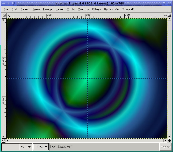
The following were all from the same set of six layers, built with the same gradient, but with only about 2-4 of the particular layers showing, depending on which particular image it is.


The following are some tiles made by the same techniques (but smaller and square, suitable for tiling).


Other effects can be had by:
- Make multiple layers, where each layer is transparent, then has
a selection (such as a circle) which is then filled with a linear
gradient. Make the circles overlap in interesting ways. If you make
them rectangles or triangles, you can be all cubist!

- Make the gradients all black-to-white, then put something
interesting underneath, which is coloured. The example below uses a
plasma fill.

- Make a background below them all which is filled with an
interesting texture.


- Move the layers up and down to get different effects.