General Icon Techniques
Techniques generally helpful with making LiveJournal user icons. These are all done with Gimp version 2.2.
General stuff
Change the GIMP environment so that you have about 50 levels of
undo instead of 5. Most modern machines have enough memory so that
that's not a problem -- especially with icons, as they're so
small.
File -> Preferences -> Environment
Always save your working image as a gimp (.xcf) file as well as the final .png or .jpg file. Firstly, you might want to go back and tweak something, and secondly, even if you're absolutely sure that you've finished, it can be good to have old files around to remind you how you did such-and-such thing that looked so cool.
Two ways of saving to your final .jpg or .png file:
- Image -> Flatten Image
File -> Save As - Edit -> Copy Visible
Edit -> Paste As New
(in the new image) Image -> Flatten Image
File -> Save
The advantage of the second method is that your original working GIMP file is still there, you don't have to do undo-undo in order to get back to your working stuff, and you don't have to do Save As in order to save your changes. The downside of the second method is that sometimes I forget to Flatten the image, which one needs to do if saving to jpg.
Large or Small?
Some people, when working on icons, like to work on a larger image and then shrink it down to 100x100, while others prefer to shrink the base image first, and then work on that. There are pros and cons to each method.
Large: Enables you to use large brushes, enables you to do fine work.
Small: No point in doing fine work on a large piece when you lose all the detail when you shrink it down. Better to work at the level of the final product. Also, fonts look better when you do them in their final size rather than a larger size and shrinking the image.
Me, I tend to work on it large for initial things like background zapping and working with large brushes, and then go small.
Cropping
When making an icon, one generally needs to take a larger image, crop it, and then eventually shrink it down to 100x100. Of course, some icons are made up of multiple images, or different bits of the same image, but they're still going to be cropped.
There are three main ways to do cropping:
- Use the Crop tool.
- Do a rectangular select on the area you want, copy it (Edit
-> Copy) and then paste into a new image (Edit -> Paste As
New).
I don't tend to do this, I feel as if I have less control. -
Use the Image -> Canvas Size window and the Move tool.
Click on the little "chain" icon so that the cropping is not forced to be the same aspect ratio as the original image -- at least for the first crop. I generally first crop the canvas into a square by typing the size of the smaller side into the other side's field. Then I move the little image around until it's more or less what I want, then confirm the crop. Then I run Canvas Size again, this time leaving the "link" bit intact, to make the square smaller.
I may then use the Move tool to move the image's layer around (because the layer is now bigger than the image, the image is now a window into the layer) to see how I like the look of this or that. If one is going to do this, one needs to do the cropping first thing, so that there is only one layer, otherwise ones layers are going to get out of sync. It's generally a good idea anyway, from a design standpoint, to do the cropping first, since one should decide on one's broad canvas first, and then do things to it.
There is a lot of tweaking done in this bit; if one doesn't like how the crop or move turned out, just undo it.
Making your image more vivid
Often enough you may start off with an image which is a bit muddy. Because icons are so small, you can't catch the same amount of detail as you would with a larger image. So you need to clean things up a bit, make it more vivid, since this is more like a mini-poster than a painting. There are a few different ways to do this; which techniques you use will depend on the particular image.
In all cases, duplicate the image layer and work on the copy: that way you always have the original to fall back on.
- Layer -> Colors -> Levels -> Auto can sometimes clean up a picture quite well.
-
Make a duplicate layer; Filters -> Colors -> Retinex will often give you a very bright contrasty image, probably too bright; however it can lift the original image by putting the bright layer into "overlay" mode.
my third TARDIS icon
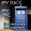 is the first one I used this technique
for:
is the first one I used this technique
for:
compare my second TARDIS icon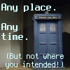 which had the same base image, but looks
a lot muddier. Note also that the third TARDIS icon uses the
"outline around text" technique described below.
which had the same base image, but looks
a lot muddier. Note also that the third TARDIS icon uses the
"outline around text" technique described below. - Make a duplicate layer; desaturate it, and tweak it in Layer -> Colors -> Levels; then put that layer in "overlay" mode, and possibly also tweak its opacity.
Working With Large Brushes
The brushes that come with GIMP are small and easy, but if one adds other brushes that people have made (such as from the GIMP Brushes section of Deviant Art) then they can be quite large, sometimes enormous. Which is fine if one is working on a 1600x1200 masterpiece, but not so great if one's canvas is 100x100, or even 300x300.
- Make a transparent layer to paint into; that makes it easier to see whether you really want that brush effect or not.
- Make the layer twice the size of the image:
- Use the Move tool to move the layer around to see if the brush result looks better in a different spot. Using the arrow keys with the Move tool enables one to have more precision than just plopping the brush in freehand.
- You may want to scale down the layer so that the result of an enormous brush is closer to the scale of your working image.
Washes
One can get some interesting effects by making a "wash" of colour over your icon.
- Make a new transparent layer.
- Set its mode to "overlay".
- Fill the layer, either with a colour, or with a gradient. This will "colourify" the image in a subtle way.
To get a stronger effect, use "grain merge" rather than "overlay". For a weaker effect, tweak the opacity of the "wash" layer.
My busy
bee icon 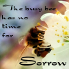 is a simple
combination of image, wash (a linear gradient done diagonally), and
text.
is a simple
combination of image, wash (a linear gradient done diagonally), and
text.
Outline around text
Since icons usually have words, it can be tricky to get them to stand out against the background. One thing that can help is to have a border around your text, say, white text and a black border (or black text and a white border, or indeed, any other colours that contrast well).
- Make a new transparent layer.
- Make the layer with the text in it the current active layer.
- Use the colour-select tool to select the text. Another way of selecting the text is to right-click on the text layer and select the "Alpha to Selection" menu item.
- Select -> Grow
Grow the selection by 1. - Make the new "outline" layer the active layer. Make sure that it's underneath the text layer.
- Bucket fill the selection. There you have a 1-pixel outline.
Variations: Grow the selection by 2, and then do a Gaussian Blur on the "outline" layer; that way you get a fuzzy outline, not so stark.
Making Shadows
This is very similar to the above "Outline around text".
- Make a new transparent layer (s1), below the layer with your object (o1) that you want to make a shadow of.
- Select the outline of the object (using whatever selection tools you find helpful) in o1.
- Do a bucket fill (black) in the shadow layer (s1).
- Select None
- Do a gaussian blur in s1.
- Activate the Move tool. Use the arrow keys to move that layer a couple of pixels down and to the right. Instant shadow! The more you move, the deeper the shadow, however if you move it too far it won't look like a shadow, it will look like a strange blurry object.
1-pixel border
- Make a new transparent layer. It's always good to have the border in a separate layer so you can decide whether the image looks better with or without a border.
- Select -> Select all
- Select -> Shrink
Shrink by one pixel. - Select -> Invert
- Bucket fill the selection with the desired colour.
And after telling you all that, here is a script which will put a 1-pixel border in the current layer automatically...
If the border is too strong, it may help to tone it down a bit by setting the layer mode to "grain merge", or to reduce its opacity by moving the Opacity slider in the "Layers" window.