Art/Icon: Jack - Anachronism
One of the tardis_icons LiveJournal Community icon challenges had a theme of "Just Jack". Inspired, I worked on a large image first, shrunk it down and then did more work on it at icon size. So this really fits into both "art" and "icon" categories.
This is the artwork "Jack: Anachronism" (two versions):


And the icon: 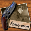
(This was done using Gimp 2.2.)
This was a combination of a few different images...
-
The sepia-toned photo was a cropped version of this picture of Jack, which I then rotated (using the Rotate tool).
I applied the "old photo" effect (Script-Fu -> Decor -> Old Photo) ticking the "Work on copy" option. I then had to do some tricky messing around to actually get a cropped version of that back, because the effect unfortunately flattened the image. First, I copied and pasted the old-photo image back into my original image, as a new layer. Then I did a Alpha-to-Selection on the original rotated image of Jack. Then I did Edit -> Cut in the old-photo layer to cut everything but the actual rotated "photo" image.
I also added a shadow layer to that (see General Icon Techniques for how to add a shadow). Then I did a duplicate of the photo layer with a few tweaks to get the photo a bit clearer. -
The gun was taken from this image, which I carefully cut out to remove the white background and have a transparent background (though it could have done with a bit more tidying up) (see Background zapping for how).
I put that in a layer, and carefully rotated that in relation to the photo part.
I then made a shadow layer for that. -
The paper with the word "Anachronism", I first did the text (trying out many different fonts as usual). Then I duplicated the text layer (so as to get something the same size) made it a little larger and filled it with a "crumpled paper" pattern. Then I duplicated that to make a shadow layer.
Then I made the paper and shadow layers the size of the image (which I initially didn't do, and got the jaggies). Then I rotated the text layer, making note of its rotation-centre. Then I rotated the paper and shadow layers, using the same centre of rotation so that they would still line up with the text. -
The background was just a pattern fill. That's why the background of the full-size version is different -- the "wood" patterns looked pretty horrible at that size, they were too small.